Thursday, June 25, 2015

Peering into the Opaque Diamond Market: A Statistical Analysis

Hi Folks! In this post, I'm going to write about something besides my trading exploits. (If you were curious, my first trade of 2015 was disastrous, but have since made it up and then some.)

This is however still related to my interest in markets, and how something is priced the way it is, and why. For personal reasons, and sheer curiosity, I decided to tackle how diamonds are priced. Going in, I already knew that diamonds are not rare at all, so price levels are purely driven by demand. Even the "3 months salary" rule is just a brilliant marketing ploy that used to be "1 months salary" in the '30s, then "2 months salary" in the '80s, and "why the hell not 3 if we can make more money off a dick-measuring contest?"

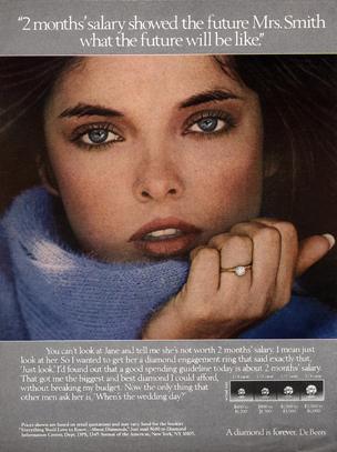
The 1980s, when a diamond cost 2 months' salary

So given today's demand for diamonds, which I can't control, what characteristics of the diamond are important in determining a diamond's value? The industry likes to tout the 4 C's of diamonds: Color, Clarity, Cut, and Carat. Which, if any, of these are important, and are there other characteristics? TLDR version: carat, color, clarity, polish, symmetry, and fluorescence. Plus you can get a good idea of how much a change in a particular rating should be worth.

With the help of my friends David Kelley and Vinod Cheriyan, I scraped and cleaned data from Borsheim's website for their round brilliant diamonds. I was able to get prices and characteristics of about 11 thousand loose diamonds of all sizes and quality. Message me if you would like details of what we did. The short version is we tweaked the webpage's source to display 2000 entries at a time (any more and their server started spazzing out).

At this point, I did some Googling to see if other people have tried this as well. Many have indeed, and some even had a much richer set of data (up to 300,000 diamonds). But they all had serious flaws such as the data being more than 5 years old or assigning integers to the different quality grades. Why are these serious flaws? 7 or so years ago, the world was in a serious recession, and as the BBC article noted, recessions are terrible on the diamond industry. The quality grades are somewhat arbitrary, and assigning consecutive integers to them is saying the difference between grades stays the same.

After much back and forth testing, playing around with different options, I settled on making binary variables out of all the categorical quality grades, regressing on the log price, and using stepwise linear regression to select which variables were important. The reasons I ended up doing what I did were a combination of practicality and technicality. 
  • Using the log price versus the raw price was a technical reason and is well documented in texts on linear regression. Another thing I did was to throw out any diamonds priced over $100,000. They would merely serve as outliers that throw off the data, and I couldn't afford those anyway. 
  • Linear regression was more of a practical issue. If you are familiar with statistical regressions, there are many assumptions needed for a linear regression to be valid, and in fact my diamond data violates a couple of those assumptions. But they were "close enough", and linear regression is very easy for a computer to run and very easy to use/interpret.
  • The binary variables (for example, Clar_VS1 = 1 if a diamond has a clarity rating of VS1 and is equal to 0 if it was given another rating) made my linear model much more flexible and precise than what other people tried. Using the model in a jewelry store is also a lot easier when I had to just pick out the right binary variables to use. (One technicality is that I had to pick a "baseline" for each of the categorical grades, and I know I screwed up on the Polish rating, so that could be something I fix in the future).
Without further ado, these were the results I got for log(Price):

Coefficient Estimate Standard Error t-value Pr(>|t|) Significance


(Intercept)  5.083641   0.020299  250.435  < 2e-16 ***
Carats    
  2.950436   0.010313  286.101  < 2e-16 ***
Carats_sq  
-0.4256   0.002675 -159.097  < 2e-16 ***
D          
 0.868540   0.009875   87.956  < 2e-16 ***
E          
 0.715325   0.009273   77.142  < 2e-16 ***
F          
 0.650658   0.009277   70.137  < 2e-16 ***
G          
 0.608767   0.008952   68.001  < 2e-16 ***
H          
 0.503347   0.009111   55.248  < 2e-16 ***
I          
 0.392778   0.008981   43.736  < 2e-16 ***
J          
 0.261261   0.009544   27.374  < 2e-16 ***
Clar_SI2  
  0.267002   0.016863   15.833  < 2e-16 ***
Clar_SI1  
  0.394074   0.016866   23.365  < 2e-16 ***
Clar_VS2  
  0.512036   0.017130   29.890  < 2e-16 ***
Clar_VS1  
  0.585566   0.017383   33.686  < 2e-16 ***
Clar_VVS2  
 0.638277   0.019064   33.481  < 2e-16 ***
Clar_VVS1  
 0.719328   0.020953   34.330  < 2e-16 ***
Clar_IF    
 0.988409   0.024029   41.134  < 2e-16 ***
Cut_G      
 0.120687   0.015989    7.548 4.78E-14 ***
Cut_VG    
  0.126871   0.007340   17.286  < 2e-16 ***
Cut_E      
 0.119555   0.005756   20.771  < 2e-16 ***
Pol_F      
-0.34244   0.168651   -2.030   0.0423 *  
Pol_G      
-0.312   0.046689   -6.683 2.47E-11 ***
Pol_VG    
 -0.299864   0.046927   -6.390 1.73E-10 ***
Pol_E      
-0.25576   0.047001   -5.442 5.40E-08 ***
Fl_Med    
 -0.069959   0.007786   -8.985  < 2e-16 ***
Fl_Str    
 -0.106875   0.010160  -10.519  < 2e-16 ***
Symm_G    
  0.182204   0.046315    3.934 8.41E-05 ***
Symm_VG    
 0.201679   0.046398    4.347 1.39E-05 ***
Symm_E    
  0.226873   0.046528    4.876 1.10E-06 ***

This achieved an R-squared of 0.96.


How to use this table: Say you have a 0.5 carat, G color, VS1, Good cut, Very Good polish, no fluorescence, and Very Good symmetry. You would take the Intercept estimate + Carat estimate * 0.5 + 0.5*0.5 * Carat_sq estimate + G estimate + Clar_VS1 estimate + ..., and exponentiate it to get the predicted price. But this isn't what it's really good for.

I am actually not all that excited about predicting the price of any particular diamond, since there will be some variability among stores and since not all diamonds have a polish, fluorescence, and symmetry rating, and thus you'd have to guess. Some places like Tiffany's might have a tremendous markup on all the prices. The best part about this model is that if you were to compare two diamonds with different characteristics, you get a great idea of how much their prices should differ. Going from a J to an H color predicts a price increase of 24.2%. Going from a VS2 to a SI1 decreases the price by 11.8%. If you've done any shopping, you will no doubt hear salesmen say "You can get a better color for a little more" and "These are the same prices, but it's a tradeoff in color and clarity." Now you actually know how much more should a better color be, and how much exactly the tradeoff should be! One last observation is that the estimates for the Cut ratings are all out of order and very close to each other. That's a strong indication that differences in Cut ratings don't matter, just whether they have a cut rating versus the baseline of "Fair or no Cut rating".

There are several caveats to my model:

  • This was only done on data from one jewelry store (Borsheims) and one particular cut of diamond (the round brilliant). While I'm pretty confident the results will hold up for most reputable dealers (luxury stores might be a different story), the different cuts are definitely vulnerable to the vagaries of tastes and fashions (the round brilliant is the most popular though). 
  • I still have some trouble fitting the high end of the price spectrum. It has a fatter tail than the log-normal distribution. Don't bother pricing the Queen's jewels with this. Plus, they know what the real rare stones are, and they aren't diamonds.
  • Maybe a stepwise selection method isn't the best in this case. There is no hard rule on when to use it, but it's possible it left out some important characteristics.
  • The bigger the differences between two diamonds you're comparing, the less accurate this will be.
Hope this was informative, and stay tuned for field results!

Friday, November 14, 2014

The Market is not Efficient ... Sometimes

First, an update on the results of the corn trade from last month. Two weeks ago, I sold my corn future for 354.75 cents per bushel, netting a tidy sum of $800. Not bad, but what happened after that? It's climbed to almost 400 cents per bushel in fits and starts. Why? According to the news outlets, autumn rains across the Midwest have slowed down the harvest, raising worries that the predicted yields will be impacted. The harvest rate has been even slower than last year, and has fallen far short of the average rate of the last 5 years. The last 5 years saw some incredible droughts though, so there wasn't much to harvest to begin with especially in 2011 and 2012. I thought I would sell ahead of a week or so of good weather in Iowa, and then re-buy if the price dipped lower, but the price started going up on the USDA's crop progress reports. Essentially, the market didn't take the publicly available information I referenced last time until almost a month later, something you wouldn't expect the market would allow to happen if you believe in efficient markets.

In my courses at the University of Chicago, two of the basic assumptions that are taught are that arbitrage does not exist, and that the market is efficient in the sense that all "relevant" information is priced in at all times. I can understand that these assumptions are necessary for some of the models we study to hold up and/or to not be overly complicated, but time and time again they are clearly violated. In the corn example, all I looked at were USDA websites and some University of Nebraska sites on corn farming. Hell, the USDA reports even did the hard work for me of comparing this year's harvest rate to last year's and the average of the past five years. The farming sites told me that farmers will leave the crops to dry in the field instead of harvesting wet crops and spending money to dry them out mechanically.

Back in January, some of you might recall the polar vortex brought frigid weather across much of the US. One Thursday morning after the first polar vortex, I turned on the tv in the gym and heard the local WGN station reporting on a shortage of propane across several northern states. I thought, "Oh that's interesting, natural gas prices must be skyrocketing." On the contrary, natural gas was only up 1-2% on the day and had crawled up maybe 5% over the previous month. I tried to do some research during down time at work, looking for data on propane demand, any past shortages, natural gas availability, but didn't find any compelling evidence either way. At the end of the day, I figured that the market would have priced in wintry events like these and took into account the demand for heating fuels. Boy was I wrong. The next morning, I turned on the tv again, and that day all the national news outlets like CNN had picked up on the story. I flipped over to CNBC and sure enough, natural gas futures had opened up over 10%.


There have been other opportunities recently too taking advantage of lags in market response time. Hazmat suit makers' stocks didn't take off until after the man in Dallas died, despite the fact we've known about a case of infection in the US. The Hong Kong stock market didn't really plummet until mainstream news outlets gave it more attention even though democracy protests and violence had been going on for days.

My next idea revolves around natural gas. One of the reasons contributing to a propane shortage last year was that last year's huge corn harvest needed to be dried and stored. Under normal circumstances, corn can be dried efficiently by air. But the unprecedented harvest meant grain storers had to add some heat to speed up the process. If this year's harvest pans out, we might see a repeat of a shortage. In fact, I contemplated buying natural gas anyways as the price fell in October. It's not a terrible idea going into the winter as heating demand rises, and there's so much supply from the fracking revolution that some gas field operators flare the gas from their wells. That's when they would burn the gas right away rather than shipping it and storing it at some terminal overflowing with gas. Alas, natural gas prices jumped up 20% in a matter of weeks as I dawdled. (It has since come back down some.)

I'd love to hear everyone's thoughts and ideas.

Sunday, September 28, 2014

How Low Can Corn Prices Go?

It's been a while since I've posted... Since then, I've started trying to put my money where my mouth is, so to speak, and dabbled in some speculative trading in options and futures. I'm also starting a financial math masters program, so I thought it would be neat to talk about applying things I learn in the classroom to my own trading ideas. The lessons I've learned from trading on my own to date could be multi-page posts, but today I wanted to write about corn prices and get your thoughts/perspectives on the corn market.

For a little bit of background, corn prices have plummeted from over $8 per bushel during the droughts of 2012 to a little over $3 per bushel today. This summer has been very mild, and the growing conditions near perfect, leading to a record estimate of over 14 billion bushels of production in the US. Driving through rural Illinois, Indiana, and Michigan, I've frequently seen happy and healthy stalks of corn as far as the eye can see.

Last week, I bought 1 corn future expiring in December for $3.3875 per bushel. So far, I feel like I'm trying to catch a falling knife: the price has since dropped to $3.23 per bushel. But here's why I'm still betting on the price rising. That record harvest is still just an expectation. Only 7% of the acreage planted has been harvested. An early freeze, a wet autumn, or anything that limits the harvest will make that projection fall short.

My one concern is the timing of the price rise. I can always roll over the future contract when it expires, no problem, but how long will I have to wait for the price to rise? A friend I talked to recently said his parents are farmers and that over the past year, they saw a lot of cash renters come in to rent farmland and grow corn. The renters were hoping for prices of $6 - $7 per bushel, so $3 per bushel will very likely be disappointing for them and will drop out of the business in droves next year.

What do you guys think?

*Disclaimer: This is not a sales pitch to invest in corn. I am not responsible if you do and end up losing money.

Thursday, September 6, 2012

The Student Debt Crisis

For the better part of this year, I've been telling friends and family of the disaster about to happen: the mountain of student debt taken on for college education. Let's start with some aggregate data. In the first quarter of 2012, the NY Fed estimated there was $902 Billion of student debt spread over 37 million borrowers. Studies by other consumer bureaus place the number well over the $1 trillion (or $1000 billion) threshold. In contrast, the 2010 census estimated the outstanding credit card debt in 2012 is $870 billion spread over 160 million cardholders. Moreover, credit card debt has been relatively flat over the last 5 years, while student loan debt has increased by 10-15% per year for the last 5 years!

So what? Why is this such a big deal? People want to and should be edumacated, you might say. Let me tell you a story: The story is about item XYZ, a crucial must-have for many as part of the American Dream. For a long time, only people who were well off or saved assiduously could afford to purchase XYZ. Then, public institutions and private lenders began offering loans for people that needed a little help to buy XYZ and sent them on their way to attaining their American Dream. XYZ sellers started noticing that demand for XYZ was rising rapidly, as well as the number of people who had the borrowed money to pay for it, so naturally the price had to go up. Now the cycle starts feeding itself: buyers were happy to borrow and buy since they saw their investments increase in value rapidly, sellers were happy to raise prices, expand their capabilities and inventory, and keep selling, and lenders were happy to keep lending as the value of XYZ kept rising. What happened? Shady buyers/sellers/lenders who had no business whatsoever buying/selling/lending entered the cycle, buyers stopped buying, and the whole system came crashing down. Replace 'XYZ' with 'houses' and you get the housing crash; replace 'XYZ' with 'college' and you have the current student debt situation just before the "buyers stopped buying and system crashing" part. What's even worse is that you can sell a house for 10 cents on the dollar if you were desperate, but recycling centers won't even give you a penny to scrap your diploma. Plus, student debt doesn't disappear in bankruptcy whereas you can surrender your house in exchange for the mortgage forgiveness.

Yesterday I stumbled upon a blog by Mark Cuban, the owner of my beloved Dallas Mavericks, while doing research for this post. Seems like he beat me to the punch on putting ideas on paper, so you should definitely read his thoughts. On a lot of things, he sounds pompous and over-confident (though it makes him a colorful sports owner), but on this he is brutally honest and spot-on.

Here's what I have to add: The bill this summer to keep interest rates on subsidized federal loans at 3.4% does not help the problem. At all. It only keeps the engine locked into 5th gear: more cheap loans available to throw out like candy. What really saddens me is the number of people in my age cohort whose votes may have been bought with their own impending misery (because what sounds good for the individual worsens the entire system). Instead of continuing to moan about our politicians' complete ineptitude of basic economics concepts, I offer some ideas/solutions.

Idea 1: As soon as possible, preferably before this upcoming admissions season revs up, announce the following limits on student loans: In the 2013-2014 academic year, all private and government student loans for undergraduates are capped at $4000 per year, decreasing to $3000 the next, and to $2000 after that (some semi-arbitrary amounts based on the current mean and median student debts of $23000 and $18,000. The time frame of the decrements could be extended as well). Mr. Cuban suggested an immediate limit of $2000/year, but here's why I favor the decremental approach. We don't want a big shock that might throw the jenga tower into collapse, and schools deserve time to adjust their income expectations. I repeat that the main driver of spiraling tuition costs is the easy availability of loans. Here's why: suppose you're a school official, and suppose you only have the noblest of goals of providing a quality education (so we're not even considering those who'd take a kid's money and say "See you in 4 years"). Say two otherwise similar applicants come to you for one spot, both have families that can pay $10,000 (an arbitrary amount), but one has taken out a loan of another $10,000. How much do you charge? You charge $20,000 because that extra $10,000 will help you towards paying for a Nobel Laureate professor, a new dorm, shiny lab buildings, a state of the art stadium, better student services, etc. The next year, with even higher demand, schools realize that they can charge a little more because students will still be willing and able to take out more loans. With tempered expectations on how much loan money is flowing in schools will have to put a brake on spending and going into debt on new buildings and whatnot. The other key is for the rule to apply to all loans used towards undergraduate education (I am not as familiar with costs of graduate and professional school so will not discuss those.) That way schools can plan knowing everybody else is going to cut back on the new building/services/staff spending spree, since a big part of increased university spending is because "every other school is doling out cash on buildings/services/staff so we have to as well in order to keep our prestige."

Idea 2: Promote and offer incentives for programs like the Ed/X initiative that MIT, Harvard, and Berkeley have agreed to start. I'm not sure what exactly the government could do since these are very recent developments. They could offer publicity, but that might smack of the government picking a champion, and the government has a long history of supporting way more unsuccessful ventures than successful ones.

Sorry for the long hiatus. I've been on vacation for parts of August. Still to come: pension arithmetic and why they are a much bigger problem than you think ... and another topic: the dirty secret of economics.

Saturday, July 21, 2012

Me gusta la gasolina

Last week's special report in The Economist was on the shale gas bonanza and was quite an enlightening read. It got me to think about one conversation I had with my dad about shale gas exploration. He mentioned that the US should drill uninhibitedly for as much gas as possible, not for the sake of having an abundant supply of another energy source, but for the sake of lowering the price of gasoline. If a physics PhD who spent over a decade in chemistry academia didn't know the difference between natural gas and gasoline, others might not fare so well either. (It's possible he's just been brainwashed by the endless stream of nonsense coming from politicians.)


 Despite both being called "gas" colloquially, natural gas and gasoline have very different sources and end uses at the moment. Natural gas comes straight from the ground as methane and other gasses (in the sense that they're not liquids or solids). That gets processed into propane, butane, etc. for electricity generation, home cooking/heating, and transportation though that has not caught on yet. Gasoline comes from crude oil that is pumped out of the ground, and is one of many products that is a result of crude oil refinery. Gasoline is almost solely used for transportation. Now you can understand why having all the natural gas in the world won't affect gasoline prices much: you can't just fill up your car with natural gas even if it was free. Only a handful of buses and trucks are designed to run on natural gas (for now, due to technological issues; more on that later), so as long as we keep making cars that burn gasoline, you have only one choice.

*Tangent: One of my favorite stories regarding prices of related commodities is a great lesson in assuming prices of similar goods must behave the same way. In the 80's, airline companies had been hedging their jet fuel costs by buying heating oil futures. Both jet fuel and heating oil are refined from crude oil, albeit by different processes. The catch was, their markets had completely different personalities. Jet fuel is only used by airplane operators, which means there were few market participants. Heating oil, on the other hand, is bought and sold by every home energy and utilities company, so there are many market participants. Now, the airlines wanted to protect themselves from a rise in jet fuel prices, and they noticed that heating oil prices moved in tandem with jet fuel prices as they had theorized. Unfortunately for them, Saddam Hussein decided to invade Kuwait, which sent jet fuel prices skyrocketing, and a mild winter kept heating oil prices low. Needless to say, they lost a ton of money when their hedge failed to recoup their operational losses. (This is also called basis risk in trading circles)

One hiccup in the natural gas market related to the technological issue I mentioned above is the difficulty in transporting and storing it. It's a gas, like a burp or a fart, not a liquid like oil or gasoline. It needs special equipment to keep it compressed so it's useable, which is why it's not feasible on cars yet. And because liquefying it requires even more expensive equipment to cool it and maintain at -162 C, the shale gas produced in America is no good to Europeans, who are starting to ban shale gas extraction, and Asians, who have yet to do much shale gas exploration. I have no doubt that some MIT professor or Exxon Mobil engineer will figure out a solution one day to make natural gas fungible like crude oil.

This post is getting quite long already, but I just wanted to mention something briefly about crude oil. Even though we can ship crude oil around the world, not all crude are created equal. There are 3 major benchmarks of crude oil: West Texas Intermediate, North Sea Brent, and Dubai crude, which differ in sulfur content and other properties. All else equal, refiners prefer WTI to Brent to Dubai. So as a word of caution, the next time you hear a politician exclaim, "Doing XYZ will send oil prices so high, it'll cripple the American economy!", think about which oil price will be affected the most. Though their prices are strongly correlated, it's not always the case. For a long time, WTI was worth slightly more per barrel than Brent crude because oil refiners preferred WTI for its lower sulfur content (or "sweetness"). Recent Middle East tensions have (rightly) increased the prices of all oil, but Brent crude soared as much as $30/barrel higher than WTI. Currently, Brent is about $15/barrel higher, which means Brent has dropped much more from its peak than WTI has.

Tuesday, July 10, 2012

Logarithmic Scale


***Addendum:
By no means do I think debt is a bad thing and must be eliminated. Debt is a lot like milk: drinking some everyday helps bone growth and keeps you healthy, but take on too much too quickly, if you've seen/done a gallon challenge, and you'll end up puking it out all over the place. Another case for why the US could be closer to Japan than Greece or Italy is that the US has control over its own currency. If all else fails, the US can inflate the debt away by printing crisp new Benjamins for its debtholders (but it would still be a disaster for all of us)
 ===================================

You've undoubtedly been asked before "On a scale of 1-10..." how tasty is the food / how hot is that girl / how much pain are you in? If you're a math nerd like me, you respond by asking first if it's a linear or a logarithmic scale. It's a fair question, especially if you want to compare a '5' to a '10'. On a linear scale, a '10' would be roughly twice as good/strong/etc as a '5'. On a log scale, it would be 25, 105, or 10245 times stronger depending on the base of your units.

For instance, the scale system used to measure earthquakes, the Moment Magnitude Scale (inaccurately called the Richter Scale, even though it's a modification of it) is a log based 10 scale of the wave amplitude on a seismograph. In terms of energy, it is roughly a base 31.6. This means a magnitude 6 quake releases 31.6 times the energy of a magnitude 5 quake, and a magnitude 7 quake releases 1000 times the energy of a magnitude 5. The Great San Francisco quake was a 7.9, and last year's quake in Japan was a 9.0, 1 million times more energy than a 5.0 quake, and 5.0s do considerable damage already.

But there's a more ubiquitous application than earthquakes that we use everyday that is really a log scale and not a linear scale: scaling large numbers whether it's populations or sums of money by the thousand, million, billion, trillion, quadrillion ... They even have nice little Latin prefixes for 'two', 'three', 'four' that make them seem smaller than they are. We don’t think of 1 million being 1000 times greater than 1 thousand. When we try to visualize 1 trillion, the tricks we use aren’t even very helpful at all. How many people truly understand what a stack of 1 trillion sheets of paper stretching from the earth into space looks like?

With the gross public debt ("public debt" + "intragovernmental debt") sitting around $15,850,000,000,000, how much is that exactly? True, it's possible we can sustain it as long as we remain the strongest economy in the world and keep growing. With public debt at around $11,000,000,000,000 and our GDP at around $15,500,000,000,000, the oft-cited Debt-To-GDP ratio is about 70%. I bet you can see why people would not want to talk about Gross Debt to GDP, which is at about 101%. The scary part is that in 2001 the Gross-To-GDP ratio was only 56% according to the Office of Management and Budget, which means that ratio has nearly doubled in 10 years. Before we laugh too hard at the Greeks and their lazy, tax-dodging lifestyle, they started having trouble in 2009 when their Gross Debt-To-GDP ratio hit 120%. Ditto with Italy this year at 120%. Considering the accelerating pace of debt growth due to increasing budget deficits and interest on the debt ($450,000,000,000 in 2008), we don't have much time.

But wait, you might ask, what about Japan? They've been running at a gross debt-to-GDP ratio of 200% and they're still chugging along. Well the difference is that around 95% of their debt is held domestically while we're at around 65%, which means they have a much safer and more captive audience for their IOUs than we do.

So next time, think again when politicians want to slap on $500 billion dollars to our national public debt like it's nothing. Think again when they trumpet a balanced budget like a panacea. It's certainly a step in the right direction, but for the debt to go down, we need a primary surplus of at least $450 billion. Don't let the rhetoric and seemingly small number of $0.5 trillion fool you (see what I did there?)... or we could be a lot closer to Greece than you think.

Friday, July 6, 2012

June Unemployment Report

I'm back, boys and girls! On the first Friday of every month, unless it happens to fall on the first of the month, the Bureau of Labor Statistics publishes the (un)employment report of the previous month.

Here is the link if you want to read it: http://www.bls.gov/news.release/empsit.toc.htm

A picky employer


Every news source has probably hashed and rehashed the stat of only a +80,000 gain in nonfarm, private payrolls and a unemployment rate of 8.2%. The number was disappointing because recoveries historically require consistent monthly gains of about +150,000. (The BLS estimates a 90% confidence interval of +/- 100,000 using their methodology, so a) +80,000 is not statistically significant using a 90% CI, and b) a real recovery would need consistent statistically significant gains... don't worry if that kinda flew by) As a refresher (and a reminder to be wary of government statistics!), the unemployment rate is calculated by U / (U+E), or the number of unemployed divided by the sum of the unemployed and employed. The employed number is fairly straightforward: if you worked, or were temporarily absent due to vacation, illness, or a strike, you're employed. But the catch is the unemployed number: you have to be not working AND able to work that time (not disabled) AND actively seeking a job. So everyone who has gone back to school or gave up searching for a job aren't even counted. As you might have guessed, that can make a huge difference.

What hits closer to home though, is something not as obvious in the report: the number of unemployed 20-24 year olds (again, this doesn't even count the ones who have gone back to school). In the report, we can count the number of unemployed aged 20+ in the labor force by sex (a total of 11.3M seasonally adjusted), and the number of unemployed aged 25+ in the labor force by education level (a total of 9.3M seasonally adjusted). By taking the difference and ignoring the possibility of people identifying as both sexes or neither, we can derive the number of unemployed between the ages of 20 and 24: 1.99M! I didn't crunch the numbers of past years, but according to Bloomberg news, this number has been rising steadily over the last 5 years. Not only are 2M of the most energetic cohort not working, the economy will be weakened in 15-20 years when we're expected to be the most productive workers in our prime.

What's being done about this? Not much I'm afraid. Our lovely presidential candidates are only focusing on healthcare or espousing Supply-Side economics (which has pretty much been laughed out of town in the econ world).  Remember the American Jobs Act of 2011? Didn't think so. It was a collection of some good ideas with some bad ideas. Tax credits for employing long-term unemployed/students and infrastructure projects were good: incentives with very specific targets tend to work well, and many roads and bridges around the country are falling into disrepair. Many of the city of Chicago's water mains were laid between 1890-1920! That's a municipal and not a federal project, but I would bet on similar levels of neglect everywhere. The bill had some bad ideas: extending unemployment benefits and "protecting" jobs of teachers/police/firefighters. Did you know unemployment benefits have already been extended several times from the original 26-week period? Plus there have been studies showing strong correlations between long benefits and time between jobs, and between long benefits and eroded incentives. As for our teachers/police/firefighters, I value their roles in society as much as anybody, but it's their absurd pension plans that are never mentioned (that their powerful unions would never want to mention), which if reformed, would mean their jobs wouldn't need protecting in the first place... definitely a topic worthy of a future post since it includes arithmetic that probably isn't fully comprehended by the public. The bill also had legitimate concerns of how it would be funded. It wasn't thought out at all past "tax people earning more than $1 million." The only parts of the bill that were passed were a tweak to the tax code, and the JOBS Act, but sadly the JOBS Act isn't even working as intended.

As expected, doom and gloom from the dismal science. Good night!

*Edit: The JOBS Act article link has been changed. Not everybody might subscribe to the WSJ